Artwork tips.
Artwork tips.
for silk screen printing

This page gives you a basic insight into what's required when it comes to your artwork. We offer in-house printing through JOYYA using G.O.T.S certified inks. If you don't speak graphic design or just need some help, don't worry we're here to help!
• JPEG (high-resolution 300 dpi)
• Photoshop (text layers need to be rasterized)
• Illustrator (images embedded in file and text/fonts converted to outlines)
• PDF (vector-based)
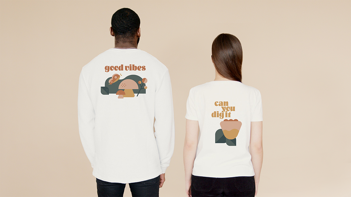
As a general rule, the simpler and bolder the design, the better it will print. Small/fine detail should be avoided as it will not print well.
All fonts must be outlined!
Please ensure all text and fonts are converted to outlines. This means that the letters are converted to shapes instead of a live font.
We can work with designs with up to 6 colors in a single location, and 8 colours total per item/garment.
If you have access to a PANTONE Color Book then please provide us the code number. If not, we will do our best to convert your colour to a print Pantone for you.
Size your design 100% to scale for the products desired print area. Product print templates are usually linked on each listing on our website.
Please make sure there is a layer for every single colour in your design file.
It can be saved as an .ai file or an .eps file, and uploaded during the purchasing process. If you stuggle to get this step completed you can email us at: team@kindredapparel.com
Word (.doc)
PowerPoint (.ppt)
Excel (.xls)
Rich Text Format (.rtf)
Graphics Interchange Format (.gif)
Ping (.png)
Bitmap (.bmp)
Minimum for Apparel is 50 units.
Artwork colours & placement needs to remain the same to meet the minimum. (ie. 2 designs at 25 units each does not meet the minimum.) You can mix & match cotton colours and sizes.
Minimum for Bags & Accessories is 100 units.
All bags or accessories must be the same item style and cotton colour with the same print colours & placement.
Minimum for Wristbands is 100 units.
Tab shapes, artwork and toggle type should be the same. Variances permitted with larger volume orders.
** Please note that there are limitations to our websites function around complex order combinations. We also service below minimum order sizes occasionally through the partnership of a local print shop in Canada. If you have questions about an order with multiple or small product combinations please reach out to us directly at team@kindredapparel.com
The order cost for all our products is calculated from 3 variables:
Each product listing on our website will allow you to self serve the pricing for your order by adding each of these variables to the product and uploading your artwork. If you would prefer a written quote prepared by our team we'd be happy to send one over asap. Please reach out at team@kindredapparel.com.
We can work with designs with up to 6 colors in a single location, and 8 colours total per item/garment.
Nope!
No extra shipping charges or set up fees will show up on your order at check out.
Our website pricing calculators will outline the cost for your item + the cost for your print options. All costs associated with completing your order (including shipping on orders over $150 CAD) are included in the per unit price.
After completing your order via the website our team will verify the selections you made via our website match the colours in the artwork that you submitted. You will be contacted within 1 business day with your digital mock up and addtional order documentation to review and confirm before production.
No, there are no extra art work charges if you are able to provide your logo or design in an acceptable format and quality.
You can send your artwork in any Photoshop or Illustrator vector formats. Jpeg can be accepted if your file has a 300dpi or higher quality at 100% scale to ensure the best printing.
If you would like assistance with designing your bag, we can assist you. ($50/hr).
We have outlined all the info you need to know about artwork here.
Joyya only does SPOT COLOR SCREEN PRINTING
Additional Details: Screen printing is the process of pressing ink through a stenciled mesh screen to create a printed design. It’s a popular technique used in a whole range of different industries, so even if you've never heard of the term before today, it’s likely that you’ve worn or used a screen-printed product at some point without even realizing. The process is sometimes called serigraphy or silk screen printing, but all of these names refer to the same basic method.
Types of Printing: There are 4 main types of screen printing that are commonly used with fabric. These are Spot Color Screen Printing, CMYK Printing, Direct-to-Garment and Heat Transfer. Joyya exclusively does Spot Color Screen Printing because we find it is usually the best solution for our customers.
Spot Color Screen Printing is where an ink specialist uses our eco-friendly water-based pigments to create colors that match each color in your artwork. The PANTONE PMS SYSTEM is used to ensure that colors are accurate, and a screen is made for each color in your artwork, with the colors layered together to create the final image. Pantone screen printing is great for printing 50+ products at a time, with between 1-10 colors.
CMYK Printing uses 4 distinct inks in different to build a composite image on a fabric, similar to how a typical ink-jet printer mixes ink when printing on paper. The method is great for printing gradients or images with more than 10 colors, but it is limited in its ability to print on darker fabrics, and it is more time-consuming to print.
Direct to Garment (DTG) printers use a completely different technology to print a t-shirt using a device that looks like a giant ink-jet printer. The technique is great for small runs of a handful of tees, but cost-prohibitive on larger orders. It also typically can't print bags, or other non-standard fabrics.
Heat Transfer is a process by which a design is printed onto transfer paper and then the ink is thermally transferred from the paper to your fabric using heat and pressure. While it is cost-effective for small orders and great for complex images, it is expensive for large orders. Also the inks sit on top of the fabric and so tend to come off more easily, resulting in a stiffer finish that isn't as long lasting.
Joyya's in-house printing team uses exclusively water-based inks for all of thier screen printing. Most apparel decorators tend to use plastisol inks which, as the name indicates, include certain plastics in their composition. While plastisol inks are generally easier to use and are cheaper to print with, they do tend to have a bigger environmental footprint. Water-based inks tend to be better for the environment, especially since we are careful in avoiding using binders, catalysts and other additives that have their own ecological issues. Check out a list of the key chemicals used in our screen printing at the bottom of this article.
We don't want to pretend the trade-offs are straight-forward, and you'll find plenty of arguments for and against using plastisols among screen printers. We won't judge if you think your order is better off with traditional plastisol pigment. While we can't do those jobs in-house, our customer care team will work with you to get your product printed through one of our printing partners.
Our Printing Inks & Dyes:
Pigment: Joyya uses Pidilite's Texcron Aqueous Dispersion Pigments which are among the top water-based pigment systems used in India. You can check out a comprehensive list of Pidilite's water-based pigments HERE
Base: Joyya uses 2 different brands of base inks depending on the product and other order-specific requirements. Both providers are listed below.
Joyya uses Aquasol Aquaprene White/Clear SD from BALAJI CHEMICALS
We use K2 White/Clear Inks from ZYDEX INDUSTRIES
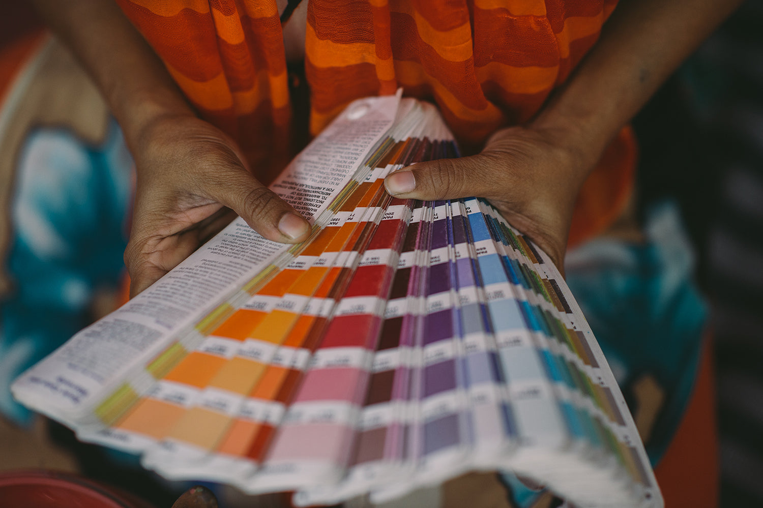
We often don't realize how challenging creating and communicating color can be. Every human eye is different, and a color can look radically different depending on the material its on, the dyes used, the lighting and even the colors it is next to. In order to ensure that 2 people across the world can discuss colors in a consistent manner, manufacturers use color systems to help them objectively discuss, measure and check colors.
Common color system standards in the industry include PANTONE, CSI, SCOTDIC and COLORO. There are many pros and cons between different color systems. Joyya uses the Pantone color system across all its manufacturing systems given it is the most commonly used system globally. However, there are tools that allow colors be be converted across color systems.
If you are more familiar with common color codes used in computer software (CMYK, RGB and HEX), these can be matched to a Pantone color using Pantone's free online color conversion database (HERE)
How are Pantone Codes used to communicate fabric colors? Pantone has created the FHI STANDARD in order to communicate colors on textiles. The colors are available in booklets and swatch cards, and provide a consistent standard against which to measure color. Colors printed on textiles have a TCX suffix on them, so Joyya uses TCX codes when discussing all fabric colors. Because TCX books are expensive, sometimes manufacturers will use TPX codes (same colors printed on paper) to get close approximations of color.
The colors are made of up 6 digits:
- The first pair of digits refers to the lightness or darkness of a color
- The second pair specifies the hue - yellow, red, blue, green
- The third pair specifies the chroma level of the color
Combined, the six digits create a consist method for communicating any color across the world.
How are Pantone Codes used to communicate colors for screen printing? Colors look different in different contexts. That is why Pantone has a different system called PMS (Pantone Matching System) for graphic designers. PMS codes are used by our graphic designers and screen printing team to develop mock-ups, check ink colors, and do quality checking on all prints. Our team uses the PANTONE FORMULA GUIDE to check colors on all orders.
Coated vs. Uncoated PMS colors will either have a C or U suffix to denote if they are a coated or uncoated color. PMS colors marked with a C mean that the color is printed on coated paper for a glossy finish, as you would see in a magazine. This is desirable for sharp and complex designs, as the ink stays on top of the paper, preventing bleeding. Likewise, a U indicates uncoated paper, which has a more porous finish, common on letterhead. Uncoated paper is generally more absorbent of ink than coated, reducing sharpness. For our purposes, we can use either Coated or Uncoated colors, though coated is more common.
To learn more about how we check and match colors and what our color tolerances are, check our this ARTICLE
No.
Exact color matching is an incredibly tricky process, and colors can look different depending on lighting, surface, or even differences in our eyes. Given the subjective nature of color perception, we use the Pantone system to help us communicate and check color. To learn more about the Pantone system, read this ARTICLE.
However, we know that customers want some confidence that what they order will be the same as what they receive. We've described below our color matching promise (which varies by scenario).
Screen Print Colors We us water-based inks in our printing process, and since we mix the pigments ourselves in small batches, we have much more control over the color that is printed. We make a sample proof at the start of every production run to ensure the finished product has the right color and we check our colors using a pantone matching book.
Since an industry-grade spectrometer is cost-prohibitive, we use PANTONE COLOR MATCH CARD, as well as a visual inspection by our trained QC team to ensure our prints are close to the desired pantone.
A few important notes on print colors:
- When printing on dark vs. light fabric, a color can look very different (see CHUBB ILLUSION)
- When printing a pattern with many overlapping colors, the overlapping lines might have slight color blends
- When printing on jute, colors can be more variable. That is because the loose-knit jute is highly absorbent and takes on color differently across the width of the fabric.
Cotton Fabric Colors Our cotton fabrics are dyed on the roll and delivered to our warehouse. We work with our dye houses to ensure that products are dyed as close as possible to our desired color. When layering fabric prior to cutting, we use both visual checks and the Pantone Color Match Card to ensure that the fabric color matches our spec.
That being said, any fabric will have slight shade variation across the roll. Short of checking color on every square-inch of a roll of fabric (an impossible task), we must operate on the basis that there will be some shade variation in the length of a roll. To mitigate this issue, we batch our cutting lots in such a way that all components of a bag or tee are cut from the same part of the fabric. This ensures shade consistency within any single tee or bag.
A few important notes on dyed fabric:
- We use shade matching to reduce color variation within a product
- you can learn more about how our tees fabric is dyed HERE
Natural Cotton & Jute
Natural, undyed fabric will tend to have the most color variation. This is because the color of the fabric comes directly from the plant or cotton bud. While combing reduces impurities in the fabric the fabric will have a natural color that will vary from batch to batch. Part of the appeal and natural look of undyed fabric is the organic shade variation in the fabric. Therefore, a natural cotton or jute product will always have a higher degree of color variation.
Color is a complicated topic and its something we know you care about. If you have more questions regarding our color matching process, or have any concerns about an order you have placed or received, contact us at team@kindredapparel.com.
Our complete product range is manufactured and printed by the fabulous staff at Joyya. Kindred is proud to be their official distribution partner in Canada for the last 15 years. Joyya is based in Kolkata India, and works to employ a community of women facing the reality of extreme poverty with a commitment to Fair Trade wages, and ethical sourcing practices. Read more about Joyya here.
Looking for proof in our pudding? We have an gallery of our past projects with clients as kick ass as you. Come have a look: